Bootstrap is a framework for building a website. It cuts out the need to build the base for a site. Instead, you can download the Bootstrap files to your server, then add a Bootstrap template. There are instructions on how to do this in our Setting Up Bootstrap article.
This will give you a basic site. However, what really makes Bootstrap impressive is its wide array of website components that can be added to the site. Since Bootstrap already has a built-in CSS and Javascript, components are already styled and functional. Of course, you can edit the CSS and Javascript to customize your site to your tastes.
The Bootstrap Grid System
Bootstrap relies on a grid system in order to properly scale components for different viewing screens. This may sound confusing, but we’re going to break down how the grid system works in this article.
The Bootstrap grid system is made up of containers, rows, and column, all of which are used to define the site’s layout.
Containers
Bootstrap containers are used to establish the width for the layout. Elements are added within the containers and will be affected by the container’s width. A container is a <div> element with a class=“container”. The container will affect all elements within the <div> container.
<div class=“container”>
  <!-- container contents go here -->
</div>
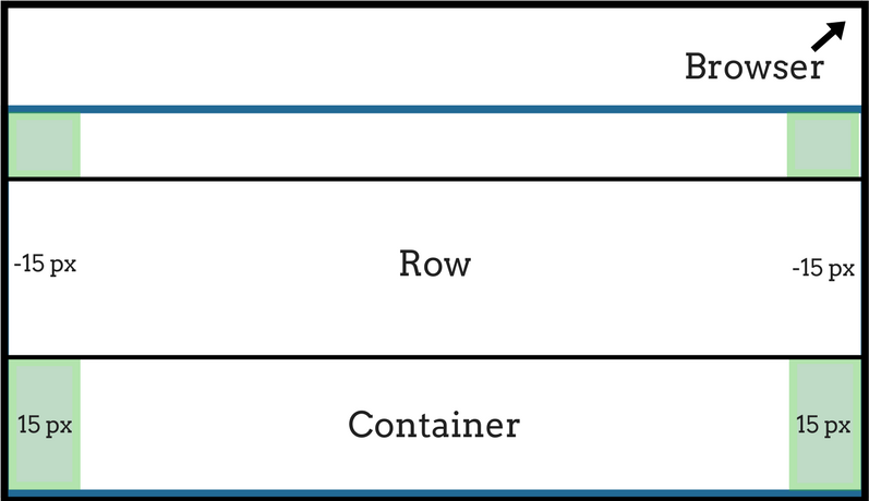
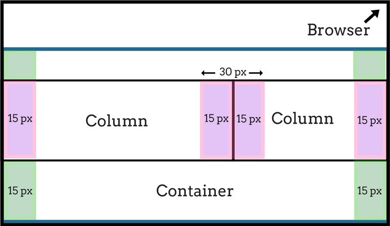
Containers have a 15 pixel padding by default, which cushions it from the end of the page and from other containers.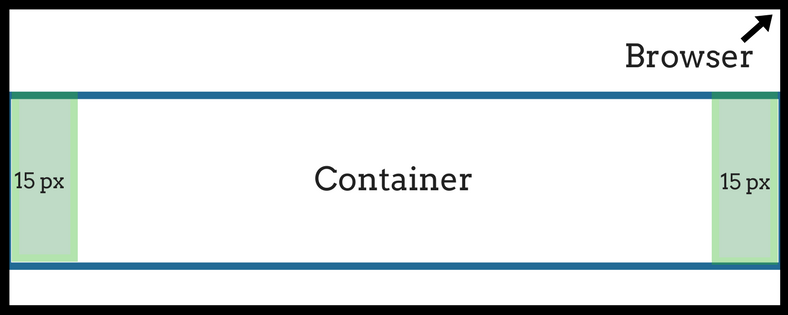
Rows and columns will be added inside the containers.
Fixed-Width Containers
Containers have default fixed widths that will change based on the size of the viewing device. The viewing device width and corresponding container width are listed in the table below:
| Viewing Device Width | Container Width |
| Less than 575px | Auto |
| 576px to 767px | 540px |
| 768px to 991px | 720px |
| 992px to 1199px | 960px |
| 1200px or higher | 1140px |
Fluid Containers
If you don’t want the containers to resize in fixed widths, you can use the class=”container-fluid” instead of class=”container”. Doing this will cause the containers to always match the width of the viewing screen, rather than resize to a fixed width.
Columns and Rows
The Bootstrap grid system allows up to 12 columns across a page. These columns can be used singly or grouped together. To group the columns together, you need to create rows. To create rows, add a div with a class=“row” that encases the column code.
Example:
<div class=”container”>
  <div class=”row”>
    <div class=”col-xs-6 col-md-4”>The content within the column.</div>
  </div>
</div>
Rows span the width of the container. They have a negative 15 pixel margin at the end, essentially removing the 15 pixel margin set by its container. This is because the columns each have a 15 pixel margin of their own that replaces the container’s margin.
Columns aligned next to each other will each have a 15 pixel margin, resulting in a 30 pixel margin between the two columns.Content within the column will be affected by the column’s 15 pixel margin.
Adding Columns
Bootstrap columns sizing can be distinguished by the column classes. The column classes are usually set up in the “col-prefix-ColumnNumber” format, which will resemble this example:
<div class=“container”>
  <div class=“row”>
    <div class=“col-sm-8”> Content </div>
    <div class=“col-sm-4”> Content </div>
  </div>
</div>
Replace the prefix and ColumnNumber with the preferred prefix size and number of columns.
Prefixes define what device the column is meant for. For example, the sm is designed for small screens, like phones.
| Size | Prefix | Column | For |
| Extra Small | None (default) | .col- | <576 |
| Small (phones) | sm | .col-sm- | ≥576px |
| Medium (tablets) | md | .col-md- | ≥768px |
| Large (laptops) | lg | .col-lg- | ≥992px |
| Extra Large (desktops) | xl | .col-xl- | ≥1200px |
The ColumnNumber at the end of grid class, such as class=“col-md-4”, establishes how many columns that it should span. In the example, class=“col-md-4”, the content within the column’s <div> would span four columns on a medium sized device, like a laptop. When a column is set with a prefix for a smaller device, such as a sm, it will display similarly on larger devices as well. In other words, a column defined as sm will work for devices of tablet size or larger.
To make columns align side-by-side, include them in the same row.
<div class="row">
  <div class="col-md-4"> Content </div>
  <div class="col-md-8"> Content </div>
</div>
In the end, you want your columns in a row to add up to twelve.
Adjusting Columns for Different Devices
You can also adjust your columns so that they will have different column widths per device size. To do this, you simply include another col-prefix-columnNumber to your class. It will look something like this:
<div class=”container”>
  <div class=”row”>
    <div class=”col-xs-6 col-sm-4”> Content </div>
  </div>
</div>
In the example, the content would be positioned across six columns for extra-small viewing screens, while medium viewing screens would change the content to show across four columns.
Nesting Columns
You can nest columns once you have a container, row, and column set up. To do this, add a new row <div> within the parent column’s code, then add your nested columns. It will function as if the area inside the new row is its own grid system.
<div class=“container”>
  <div class=“row”>
   <div class= “col-sm-6”> Parent column content
     <div class=“row”>
         <div class=“col-xs-6”> Child column content </div>
     </div>
   </div>
  </div>
</div>