Bootstrap has templates for many basic website components, such as forms. You can use these templates as a springboard into creating a custom form. Bootstrap also supplies preformatted form elements that you can easily swap in or out of your form. We’ll go over the basics for customizing your form's layout here. To see all of the available form templates and elements, see the Forms section of the Bootstrap CSS page.
If you are looking for instructions on how to add items to a Bootstrap form, see our How to Add Items to a Bootstrap Form article.
Form Customizations
There are several types of form customizations: groups, controls, grids, rows and columns, horizontal, auto-sizing, and inline. Each will style your form in a different way. In some instances, you can use different types of customization within the same form.
Form Groups
Using form-group classes in your form will automatically add spacing for labels and controls (a type of form item).
You can add the form-group class to your form by encasing each label and control in a div class with the form-group class:
<div class ="form-group"> <!-- Bootstrap Label or Control code here --> </div>
Each form element and label needs to be in its own form-group class. If they are not, the spacing style will not be applied.
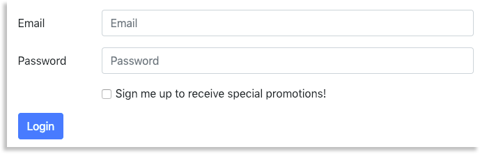
As you can see in the example below, the form that uses class="form-group" has applied spacing, while the form without class="form-group" doesn't apply much space between the form items.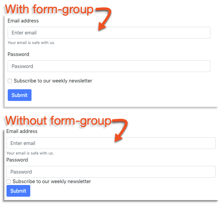
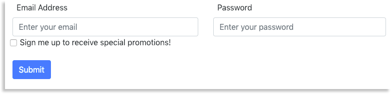
In a large form, using the form-group class may be applied like this:
<form>
<div class=”form-group”>
  <label for="example">Email Address</label>
  <input type="email" class="form-control" placeholder="Enter your email">
</div>

<div class=”form-group”>
  <label for="example">Password</label>
  <input type="password" class="form-control" placeholder="Enter your password">
</div>

<button type="submit" class="btn btn-default">Login</button>
</form>
The example above will show the automatic spacing of the form-group class: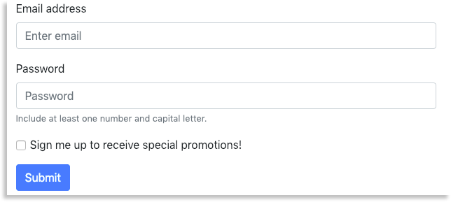
Form Controls
The form-control class is different from the form-group class. While form-group sets up the spacing between form elements, form-control sets the width of the form element to 100%, causing it to span the width of the form and resize with the window.
Form-Control in a Selection
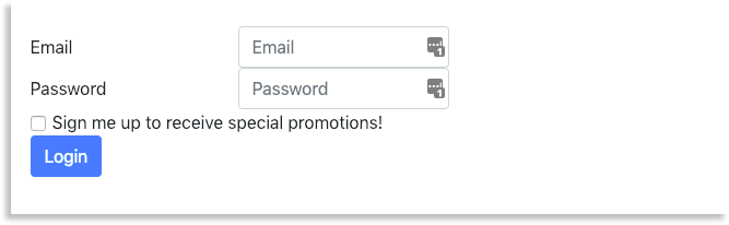
For example, if you wanted to add a selection form element with form-control, the code would look like this:
<select class="form-control">
  <option>Option 1</option>
  <option>Option 2</option>
  <option>Option 3</option>
  <option>Option 4</option>
  <option>Option 5</option>
</select>
Below, you can see the difference between the code above with the form-control class and without the form-control class.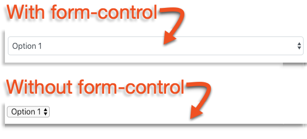
Form Grids
You can use the Bootstrap grid system to organize your form. You can organize your form controls into columns and rows.
If you aren't familiar with the Bootstrap grid system, check out our article, Understanding Bootstrap's Grid System.
You can add columns and rows by adding <div class="row"> and <div class="col"> to your form.
Here's an example of how you can use rows and columns in form code:
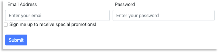
<form>
  <div class="row">
    <div class="col">
      <label for="exampleEmail">Email Address</label>
      <input type="email" class="form-control" placeholder="Enter your email">
    </div>
    <div class="col">
      <label for="examplePassword">Password</label>
      <input type="password" class="form-control" placeholder="Enter your password">
    </div>
  </div>
  <div class="form-group">
      <input type="checkbox" class="form-check-input" id="exampleCheckbox">
      <label for="exampleCheckbox">Sign me up to receive special promotions!</label>
  </div>
  <button type="submit" class="btn btn-primary">Submit</button>
</form>
In the example above, the email and password fields are separated into two columns within a row. This is why they are displayed side by side on a webpage. Because the checkbox is not in the row, it is placed beneath both the email and password fields. If another row came after this, it would also be placed underneath the previous section.

The same rules that apply to Bootstrap's grid system apply to the grid forms. Keep in mind that columns go inside rows and that you can have up to twelve columns in a row.
You can specify how many columns you want a form control to take up by using <div class="col-prefix-#"> instead of <div class="col">. To learn more about column prefixes and numbers, see our Bootstrap grid system article.
Form Row
Like form grids, form rows use the same grid structure of columns and rows to style the form. However, using the form row class implements a tighter spacing style for columns within a row. So, instead of using <div class="row">, you would use <div class="form-row"> in its place. The below code is an example of how the form-row class may be used:
<form>
  <div class="form-row">
    <div class="col">
      <label for="example">Email Address</label>
      <input type="email" class="form-control" placeholder="Enter your email">
    </div>
    <div class="col">
      <label for="example">Password</label>
      <input type="password" class="form-control" placeholder="Enter your password">
    </div>
  </div>
  <div class="form-group">
    <div class="col">
     <input type="checkbox" class="form-check-input" id="exampleCheckbox">
     <label for="exampleCheckbox">Sign me up to receive special promotions!</label>
    </div>
  </div>
 <button type="submit" class="btn btn-primary">Submit</button>
</form>
The above code is displayed with a smaller gap of space between the two columns:
Now compare the above image (that uses the form-row class) to the image below (that uses just the row class). The amount of spacing between the two columns in the above image is smaller than the below image.
Form Auto-sizing
It is possible to set up forms that will automatically size themselves based on the form's content. While it still operates on a grid, all that is needed to implement an automatic sizing layout is to swap out the class="col" for class="col-auto"
For example, the code below uses auto-sizing class:
<form>
  <div class="row">
    <label for="exampleEmail" class="col-sm-2 col-form-label">Email</label>
      <div class="col-auto">
        <input type="email" class="form-control" placeholder="Email">
      </div>
  </div>
  <div class="row">
     <label for="examplePassword" class="col-sm-2 col-form-label">Password</label>
       <div class="col-auto">
          <input type="password" class="form-control" id="examplePassword" placeholder="Password">
       </div>
  </div>
  <div class="row">
    <div class="col-auto">
      <div class="form-check">
        <input class="form-check-input" type="checkbox" id="exampleCheckbox">
        <label class="form-check-label" for="exampleCheckbox">
        Sign me up to receive special promotions!
        </label>
      </div>
    </div>
  </div>
  <div class="row">
    <div class="col-auto">
      <button type="submit" class="btn btn-primary">Login</button>
    </div>
  </div>
</form>
This will result in a form that automatically sizes itself based on the fields and labels:
Horizontal Form
The horizontal form uses a combination of grid and form grouping. It uses both columns and rows, as well as the form-group class. The form will list labels and form controls horizontally, depending on the column layout.
Here is an example of what the code for a horizontal form would be like:
<form>
  <div class="form-group row">
     <label for="exampleEmail" class="col-sm-2 col-form-label">Email</label>
       <div class="col-sm-10">
         <input type="email" class="form-control" placeholder="Email">
       </div>
  </div>
  <div class="form-group row">
    <label for="examplePassword" class="col-sm-2 col-form-label">Password</label>
       <div class="col-sm-10">
         <input type="password" class="form-control" id="examplePassword" placeholder="Password">
       </div>
  </div>
  <div class="form-group row">
    <div class="col-sm-2"></div>
      <div class="col-sm-10">
        <div class="form-check">
          <input class="form-check-input" type="checkbox" id="exampleCheckbox">
          <label class="form-check-label" for="exampleCheckbox">
          Sign me up to receive special promotions!
          </label>
        </div>
      </div>
    </div>
  <div class="form-group row">
    <div class="col-sm-10">
      <button type="submit" class="btn btn-primary">Login</button>
    </div>
  </div>
</form>
The above code will align the labels and controls horizontally:
With the horizontal form, it is important to include a special class with some control labels. This class is:
<label class="col-sm-2 col-form-label">Password</label>
This class arranges the labels on the form, so forgetting it could result in strange label positions.
Inline Forms
You can create an inline form by adding a form-inline class to the <form> element at the beginning of your form. This will align controls and labels in the same row in a horizontal line.
Here is an example of a form using the inline format:
<form class="form-inline">
  <label class="my-1 mr-2" for="exampleEmail">Email</label>
  <input type="text" class="form-control mb-2 mr-sm-2" id="exampleEmail" placeholder="email">

  <label class="my-1 mr-2" for="examplePassword">Password</label>
  <div class="input-group mb-2 mr-sm-2">
    <input type="text" class="form-control" id="examplePassword" placeholder="password">
  </div>

  <div class="form-check mb-2 mr-sm-2">
    <input class="form-check-input" type="checkbox" id="inlineFormCheck">
    <label class="form-check-label" for="inlineFormCheck">
     Sign me up to receive special promotions!
    </label>
  </div>

  <button type="submit" class="btn btn-primary mb-2">Submit</button>
</form>
The above code will create a form that is displayed inline:
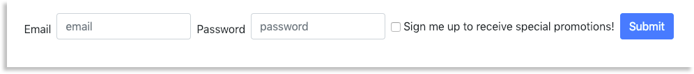
Notice that in this example, the labels and controls have different classes that we have not used in previous examples. These new classes are responsible for adding new spacing guidelines for this example. Inline forms can disturb the default spacing layout, so it may be necessary to use classes, like above.
You can go to the Bootstrap official documentation Spacing page to find out more about these classes.
If you want more information about Bootstrap forms, check out our How to Add Items to a Bootstrap Form article.