Bootstrap gives you all the tools to easily customize your forms. With Bootstrap, you can add new form “controls,” like checkboxes or text areas, with an already established styling. This article will show you the basic ways to customize your form and the code needed to include each control.
If you are looking for instructions on how to create a Bootstrap form layout, see our How to Customize Bootstrap Form Layouts article.
Form Controls
Controls are another name for Bootstrap items, like text areas and checkboxes, that can be added to your form.
Inputs
One control is called "inputs." Inputs are fields where the user can enter text. Below is an example code that can be used to add an input control into your form:
<input type="email" class="form-control" placeholder="Enter email">
The code above will turn out like this:
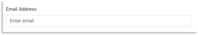
In the code, the type declares the kind of input. In the case of the example, this would be the "email" type. The placeholder defines text that is displayed within the input box. The example above uses "Enter email" as placeholder text. This text will disappear when a user starts to type in the text box.
Bootstrap inputs support HTML5 input types, meaning that you can use any of the following types:
| color | date | datetime |
| datetime-local | month | |
| number | password | search |
| tel | text | time |
| url | week |
These types can be declared by adding a type="---" to your input, like in the example. If you wanted to add an email input, you would change it to type=“email”
<input type="email" class="form-control" placeholder="Enter email">
Keep in mind that you need to include an input type if you want your control to be correctly styled.
Text Area
The text area control is an area that allows for large quantities of text, like a comment section.
Below is a snippet of example code that shows how a text area control would be used:
<textarea class="form-control" rows="3" placeholder="This is the text area!"></textarea>
This code would render a text area like this:
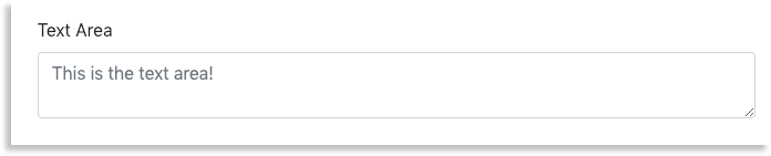 When adding a text area, you can customize the size by declaring how many rows you want it to span. Since Bootstrap is built on rows and columns, you can make the text area smaller or larger by increasing or decreasing the number of rows.
<textarea class="form-control" rows="3" placeholder="This is the text area!"></textarea>
In the example above, the text area spans the length of three rows.
Checkboxes
The checkboxes allow users to select multiple options. By default, checkboxes are displayed vertically. However, you can change the checkboxes to display horizontally by changing the type to type="checkbox-inline". For vertical checkboxes, see our Basic Checkboxes section. If you want to display checkboxes horizontally, see our Inline Checkboxes section.
Basic Checkboxes
Basic checkboxes are displayed vertically.

Code for the basic, vertical checkboxes look like this:
<div class="checkbox">
  <label>
    <input type="checkbox" value="opt1">
    Option 1
  </label>
</div>
<div class="checkbox">
  <label>
    <input type="checkbox" value="opt2">
    Option 2
  </label>
</div>
Checkboxes contain a value, which will be used to differentiate between other checkboxes. Be sure each checkbox has a unique value.
To display checkboxes horizontally, see the next section.
Inline Checkbox
Inline checkboxes are displayed horizontally, like the example below.

While the code for inline checkboxes is very similar to that of vertical checkboxes, there is one important difference. Horizontal checkboxes have the class="checkbox-inline" added to the label element.
<label class="checkbox-inline">
    <input type="checkbox" value="opt1">
    Option 1
  </label>
  <label class="checkbox-inline">
    <input type="checkbox" value="opt2">
    Option 2
  </label>
Checkboxes contain a value, which will be used to differentiate between other checkboxes. Be sure each checkbox has a unique value.
The inline checkboxes are set up differently than the basic checkboxes. In the inline checkbox code, the <label> element is the one that is given the class=”checkbox-inline”. However, if you look at the basic checkbox code, you will see that the class=”checkbox” is declared in a <div> element, not the <label> element.
Radio Button
A radio button is similar to a checkbox. However, only one radio button may be selected at a time, while checkboxes may have multiple boxes selected.
As with checkboxes, the default is to display the radio buttons vertically, though you can also change the code to display them horizontally.
Basic Radio Button
By default, radio buttons will display vertically, as seen in the example below:

The code for this example looks like this:
<div class="radio">
  <label>
    <input type="radio" name="radioButtons" id="Radio1" value="opt1" checked>
    Option 1
  </label>
</div>
<div class="radio">
  <label>
    <input type="radio" name="radioButtons" id="Radio2" value="opt2">
    Option 2
  </label>
</div>
<div class="radio">
  <label>
    <input type="radio" name="radioButtons" id="Radio3" value="opt3">
    Option 3
  </label>
</div>
With radio buttons, you can select a radio button to be selected by default. Add "checked" to the end of one of your radio buttons to select it.
Much like checkboxes, radio buttons need to have a defining value. These values will be used to differentiate between other checkboxes. Be sure each checkbox has a unique value.
Radio buttons also need a name and id attribute in order to function properly. If you forget to include them, the user will be able to select multiple radio buttons at the same time.
Inline Radio Button
In order to make the radio buttons display horizontally, add class="radio-inline" to the radio button's label element.
The above example's code will look like this:
<label class="radio-inline">
  <input type="radio" name="radioInline" id="inlineRadio1" value="inlineOpt1"> Option 1
</label>
<label class="radio-inline">
  <input type="radio" name="radioInline" id="inlineRadio2" value="inlineOpt2"> Option 2
</label>
<label class="radio-inline">
  <input type="radio" name="radioInline" id="inlineRadio3" value="inlineOpt3"> Option 3
</label>
As with the checkboxes, the inline radio button code differs from the basic radio button code. The class=“radio-inline” is situated in the <label> element in the inline radio code instead of in a <div> element, like it is in the basic radio code.
Inline radio buttons also require the same elements as basic radio buttons: each radio button must include a name, id, and value in order for the radio buttons to work properly.
Selection Menus
Drop-down selection allows the user to select an option (or several options) from a list of options. You can create a drop-down selection that only allows one option to be selected or allows for multiples.
For single option only selections, see our Single Option Selection section.
To allow users to select more than one option, see our Multiple Option Selection section.
Single Option Selection
A single selection drop-down displays when clicked. A user is able to select one option from the drop-down, like in the example below:
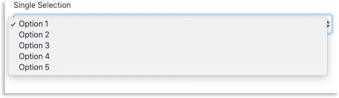
However, their code differs. A single select drop-down will resemble the code below:
<select class="form-control">
  <option>Option 1</option>
  <option>Option 2</option>
  <option>Option 3</option>
  <option>Option 4</option>
  <option>Option 5</option>
</select>
The code is a select element with nested option elements.
Multiple Option Selection
Multi-select drop-downs display in a way that allows multiple options to be selected, as seen below:

The only difference between the two is within the <select> element. In the drop-down selection, it reads <select class="form-control">. However, in the multiple selection menu, it is shown as <select multiple class="form-control">.
<select multiple class="form-control">
  <option>Option 1</option>
  <option>Option 2</option>
  <option>Option 3</option>
  <option>Option 4</option>
  <option>Option 5</option>
</select>
This difference allows users to select multiple options at once.
Add Help Text to a Component
You can add help text to your controls. Bootstrap will automatically format the text as help text, which is usually displayed in smaller text under the form element. Here is an example of help text:

To add help text, add a <small class="form-text text-muted">Help Text Here</small> below your form element.
<label>Help Text Example</label>
<input type="text" class="form-control">
<small class="form-text text-muted">Help Text Here</small>
The <small> element adds smaller text directly underneath your form element. The class="form-text text-muted" changes the color of the text to gray.
If you are looking for more information about Bootstrap forms, check out our How to Customize Bootstrap Form Layouts article.